Wednesday, February 27, 2019

Technical Analysis For Beginners Part 5: How To Trade The Hidden Divergence in Forex

The divergence that forms in the forex market is one of the set ups that many traders look for from time to time. The same with the head and shoulder pattern, it doesn’t show up all the time but when it does, it gives traders a big upper hand over the market.

Divergence is a situation in the market where in the price chart shows a certain direction of the price but the technical indicator such as the Relative Strength Index or RSI shows the opposite direction.

Technical indicators are supposed to mimic the movement of price but in the case of a hidden divergence it shows a different outcome. Seeing this in the chart will make you think that there is something fishy about the market. This abnormality translates to forex trading as a reversal of the current price movement.

To make this all clear and less confusing, I will show you some examples of hidden divergence in the forex market that are hard to see if you don’t know where to look. Divergence in the market occurs on any time frame but in the examples I will be using the 4 hour time frame.

Also, the technical indicator that I will be using is the RSI with its default settings.

There are two types of divergence in the forex market; the bullish divergence and the bearish divergence


  1. Traders call it bullish divergence when the price action is bearish or down trending but the technical indicator which is the RSI is showing a bullish move or a consolidating move defying the real movement of price which is supposed to be a bearish move.
     
  2. Traders call it bearish divergence when the price action is bullish or up trending but the RSI is showing a bearish move or a consolidating move defying the real movement of price which is supposed to be a bullish move.

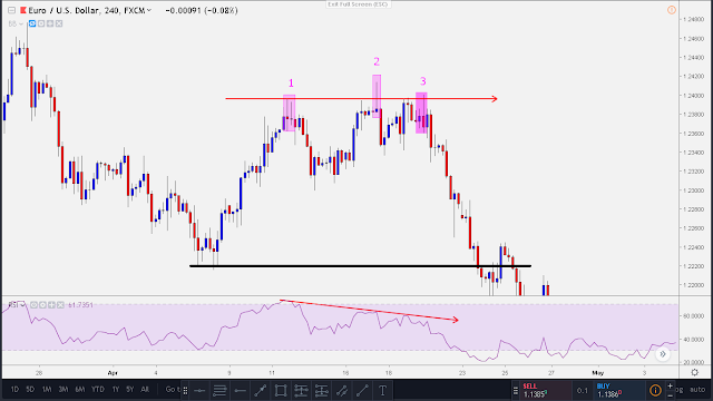
Bearish divergence example in the EURUSD forex pair in the 4 hour time frame

forex bearish divergence
Click the image to zoom in..

Observe that the price is basically showing a sideways direction with a somewhat bullish bias as it created a higher high indicated with the number 2.

But look at the RSI indicator below.

What have you noticed? 

The RSI indicator was showing a different data, it is clearly showing us a down 
trending graph as indicated with the red arrow going down.

This is how a bearish divergence looks like! Two graphs ( price graph and RSI graph ) showing different facts that are supposed to be the same.

The question now is this..

How to trade this divergence forex set up?


We could confirm that this is a divergence when both graph showing contradicting movements.
All we have to do after that is to wait for a candle stick set up for an entry. We need to wait for a candle stick set up so that we can plan our entry and stop loss point.

Seeing that bearish pin bar formed as indicated with number 3, we can now put on our entry point and stop loss.

Our entry point would be right after the pin bar formed or perhaps you could wait for a little bit of pullback.

Our stop loss placement would then be above that bearish pin bar.

Our logical placement of the profit target would be right at the previous resistance as shown with the black horizontal line.

The final set up of the trade would look like this

forex bearish divergence set up
Click the image to zoom in


I don’t know if there are forex divergence scanner out there but what happened with the market after just shows us how powerful and profitable bearish divergence set up could be if traded correctly. In this particular trade it could have been an easy 1:4 risk to reward ratio winning trade.

 Bullish divergence example in the EURGBP forex pair in the 4 hour time frame


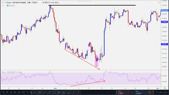
 In this pair we could see that the price chart is showing us a down trending price. But when we look at the RSI graph below it, we could clearly see that the graph is showing an uptrend movement as indicated with an upward pointing arrow.
forex bullish divergence
Click the image to zoom in

With these we could confirm that this forex pair at this particular time is bullish divergence.
Since this is confirmed already, we can now use our divergence forex system strategy set up.

We wait for a candle stick formation that signals a start of a bullish move.

Observe that a bullish pinbar formed followed by a bullish engulfing candle as indicated with the magenta rectangle.

Our entry point would then be right after that bullish engulfing candle and we put our stop loss below the pin bar.

The logical placement of the profit target would be below the resistance as indicated with the horizontal black line.

The final forex divergence trade set up would look like this

forex bullish divergence set up
Click the image to zoom in

This trade here could easily give us a 1:4 risk to reward ratio.

Forex divergence trade set up combined with a reliable candle stick formation will not only  give us a great edge in the market but also big profits.

Patiently scan your chart for these kinds of patterns and you will be rewarded.

The big question is that are you willing to wait for this kind of patterns to occur in the market?
See you in the last and final part of this article series!

Tuesday, February 12, 2019

Technical Analysis For Beginners Part 4: Trading The Ever Famous Head and Shoulder Pattern

Price action formations in the FOREX market seems very random to starting traders. I remember when I first look at a chart 2 years ago I could not mentally form any formation at all.

All seems to be just random ups and downs of the flow of the market. Never did I realize that the ebb and flow of the market is all driven by people’s psychology.

Later on as I put more time in studying and observing how the market moves, I came to conclude that there are certain patterns formed repeatedly.

In this part 4 of these article series, I want to talk about the ever famous head and shoulder pattern formations.


It’s undeniable that there are many patterns out there but this pattern formation is the most or if not one of the most pattern formation traders looked for in the market.

Why do traders look for this head and shoulder patterns?


  • First of all it’s easy to recognize because of its obvious formation.
  • Second reason is that this set up has a huge probability of forming which means it has high win rate.
  • The final reason is that depending on how the pattern forms it usually gives good risk to reward ratio.

Take a look at our example below.

head and shoulder pattern in 4 hr time frame
Click the image to zoom in

This head and shoulder pattern formed in the EURNZD 4 hour time frame. 

As you can see, this pattern formation is quite obvious. Derived from its name itself it is composed of two shoulders and one head..


head and shoulder trade set up
Click the image to zoom in
On trading this kind of pattern, its is best traded right at the formation of the right shoulder. As you can see in the example above. There is a bearish pin bar set up formed in the right shoulder. 

Entry point would be right after this pin bar formed. 

The stop loss should be placed above the pin bar.

The most logical place for the profit target would be the bottom of the left shoulder which is a known support indicated with a red horizontal line.

This trade set up using the head and shoulder pattern alone could have generated a good 1:6 risk to reward ratio.

The inverted head and shoulder pattern


The inverted head and shoulder pattern is pretty much the same with the usual head and shoulder pattern. It just that this formed in reversed form but mind you  the concept is still the same.

inverted head and shoulder pattern
Click the image to zoom in
This inverted head and shoulder pattern was formed in the NZDUSD pair 4 hour time frame.

In the eyes of those novice traders this might look hard to recognize as a pattern. But the more you put time on studying charts there will come a time when you will be able to recognize this patterns almost instantly.

Since this is an inverted one we should be looking for a set up here to go long. In my own style of trading, the set up would go like this.

inverted head and shoulder trade set up
Click the image to zoom in

As I have talk about in my previous article about Japanese candle stick formation where the topic is about engulfing candles and its psychology. This bullish engulfing candle here could be our signal that the price would be bullish and will form the inverted pattern.

Our entry would be right after the bullish engulfing candle formation.

Our stop loss must be placed below the candle that had been engulfed.

Our profit target again should be based on the pattern itself. In this inverted one it should be placed at the top of the leg of the left shoulder which is a known resistance indicated with a green horizontal line.

In this particular trade set up, we could have had easily generated a 1:4 risk to reward ratio winning trade.

In summary of this article.

Head and shoulder pattern is literary composed of a HEAD and a SHOULDER which makes it easy to recognize.

If its a usual head and shoulder pattern, look to trade short right at the formation of the RIGHT SHOULDER.

If its an inverted head and shoulder pattern look to trade long at the RIGHT SHOULDER. 

A pin bar or an engulfing candle formation at the right shoulder usually is the signal for an entry.

Stop loss should be placed above or below the set up candle.

And lastly, the best placement of the profit target is in the parallel side of the leg of the left shoulder.


See you in part 5!


Monday, February 11, 2019

Technical Analysis for Beginners Part 3: Psychology Behind Japanese Candle Stick Formations

I can’t remember fully the story about the origin of Japanese candle sticks, can’t even remember if I read it from a book or from a blog of some famous trader. But the summary of the story goes like this.

 There’s this Japanese guy who become so good at trading commodities because he records the highest point, the lowest point, opening and closing price of the commodities that he is trading.  Later on he learned that he could make a drawing out of it which is now the candle stick. He’s so good with trading because he understood the psychology of the market by the use of the candle stick formations.

 In this part 3 of technical analysis for beginners our aim is to know how to read the candle stick formations. We will be using the DAILY TIME FRAME in our examples because I believe that the daily candles are more accurate in portraying the psychology of traders.


 Let’s begin with the parts of the Japanese candle sticks


A candle is composed of a body that’s for sure and sometimes with an upper tail and/or lower tail.

  1.     The upper tail indicates the highest value the price went in that particular day.
  2.     The lower tail indicates the lowest value the price went in that particular day.
  3.     The open is the opening price of the day and
  4.     The close is the closing price of the day.   

See the image below for reference.


japanese candle stick
Credits to Wikipedia for this image

It’s parts are pretty basic and self-explanatory that’s why we move on and see some examples of its formations and understand the message that it brings.

 --------------------------------

bullish candle
 Click the image to zoom in


That candle enclosed with green rectangle is our first candle to be explained.  To tell you the truth I don’t know what this candle specifically called but the important things is knowing the meaning behind it.


Noticed that the lower tail of the candle is longer than the body itself. This candle brings the message that the price has a big probability of going up which it did. Having this long tail simply shows that there are more buyers in the market.


bearish candle
 Click the image to zoom in

The candle above enclosed with rectangle has the same meaning with the first candle that I have explained. It’s just that this candle signifies that the price would probably go down.

 --------------------------------


 Now let’s talk about pin bars. 


This candle stick pattern is actually just similar to that of the first two candles that I’ve shown but has a much smaller body.

There are so many traders out there who complicate their lives and made some other names for it like, hammer, shooting star, sword and etc. To avoid confusion of names if a candle looks like this as shown below let’s call it a pin bar.

bullish pin bar candle
Click the image to zoom in

This two candles enclosed in a rectangle is called a pin bar. Its body is relatively small and its tail is very long.  Long tail formed because price initially moved in that direction but was rejected. If we see a long tailed pin bar like this then that only indicates that there's a big chance that the price would go up.

Another example below.

bearish pin bar candle
Click the image to zoom in

 As you can see, its very clear what these bearish pin bar's message is. It shows that in that particular days the sellers dominated the market and created a strong sell down.

This candle stick formation will serve as a catalyst for price direction in short term or long term.


--------------------------------

Doji, the candle in the middle


doji candle
Click the image to zoom in
Basically the doji candle is a plus sign. It has an equilibrium formation of buyers and sellers. If this candle stick form, it usually means that the current trend is ending and a new trend is approaching.

Doji is a trend reversal candle.

Its that time in the market when the dominating movement of the market just halted and exhausted.

As you can see in the example above, it just shows that the trend had just arrived at its peak and instantly reversed.

doji candle reversal
Click the image to zoom in
Another example above of a Doji candle formation which acted as a catalyst for price reversal.

We are done with the single candle formations, now lets go to the combination of these candles and lets try to understand its psychology behind.

--------------------------------

Inside Bar Japanese Candle Stick Formations


inside bar candle
Click the image to zoom in


The above image is an example of what an inside bar candle looks like.

An inside bar is basically a candle which is formed inside the previous candle. Inside bar formations indicates indecisiveness also in the market.

The big candle is what they called the mother candle and the small one is its child.

Something to note here. In the above image you can only see 1 child/inside candle but there are times that inside bar candles can be as much as 3 candles. The more the candle inside, the more the strong the momentum when its price broke the mother candle.

How do we trade the inside bar set up?


Trading the inside bar candle is quite tricky.

Usually traders trade this set up when the prices broke out the mother candle but sometimes this is where the fake movement happens.

As you can see in the image above a bearish pin bar was formed. Intraday, the price broke to the upside and looks bullish, many traders thought it was going up but it was a trap. Eventually the price came back inside the mother candle and formed this bearish pin bar set up.

To me this is the best time to trade inside bar candles. The market made a false move and after that it shows its real intention. Lets take a look at another example below.

inside bar fakey set up
Click the image to zoom in
Noticed here that there are 2 child candles inside the mother candle formed before the appearance of the false breakout. This to me indicates a strong momentum to whichever side it decides to go.

The false breakout formed and buyers saw this set up and made the price very bullish.

--------------------------------

If we have inside bars we also have outside bars which is commonly called ENGULFING CANDLES.

Engulfing Japanese Candle Stick Formations


bearish engulfing candle
Click the image to zoom in

Engulfing candles are candles who engulfs/eat the previous day candle. This indicates rejection of price and when you combine these two candles it will somewhat form into a pin bar.

I find engulfing candles a very good set up in taking trades because it shows clearly the sudden shift of momentum between buyers and sellers.

How do we use the engulfing candles as a set up for a trade?


The best time to trade engulfing candles is when it formed at least twice in a known support or resistance area. Just like what happened in the image above. The bearish engulfing candles formed right at a resistance twice. After the formation of the second bearish engulfing candle, the price just burst to the downside.

The above chart of AUDCHF forex pair shows 2 engulfing candles. Lets try to see where should we entered the trade and its risk to reward ratio.

engulfing candle trade set up
Click the image to zoom in


We could have entered right away a short trade after the second engulfing candle formed. The stop loss placement should be above it with a 3 to 5 pips allowance for the spread.

Looking at the price action we can automatically conclude where our profit target should be located. It should be in the previous support of 0.74180 as indicated with the horizontal blue line.

What happened after we took our entry? The market just did its thing and moved towards the direction of our profit target. After 8 days of waiting our profit target was finally triggered and bagged 1:4 risk to reward ratio.

Understanding Japanese candle stick formation is really essential in creating a trading strategy. In my own opinion the more you combine this candle stick formation with each other the higher the chance of it going your desired direction.

Take time in studying charts and you will see this set ups forming over and over again. The part 4 of this article series will be about head and shoulder pattern. Stay tuned..

Ciao and till next time again!